

Career Development Booklet
Editorial Design
Illustration
Project Overview
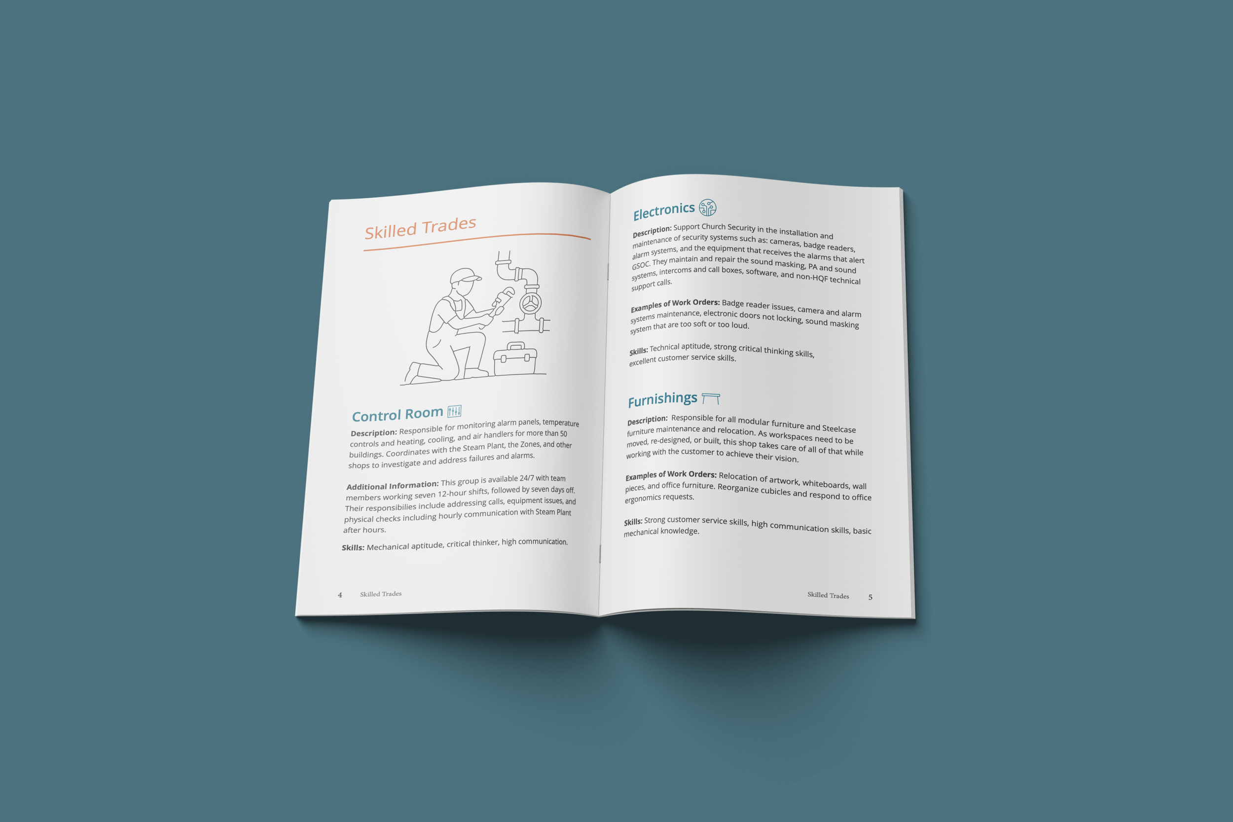
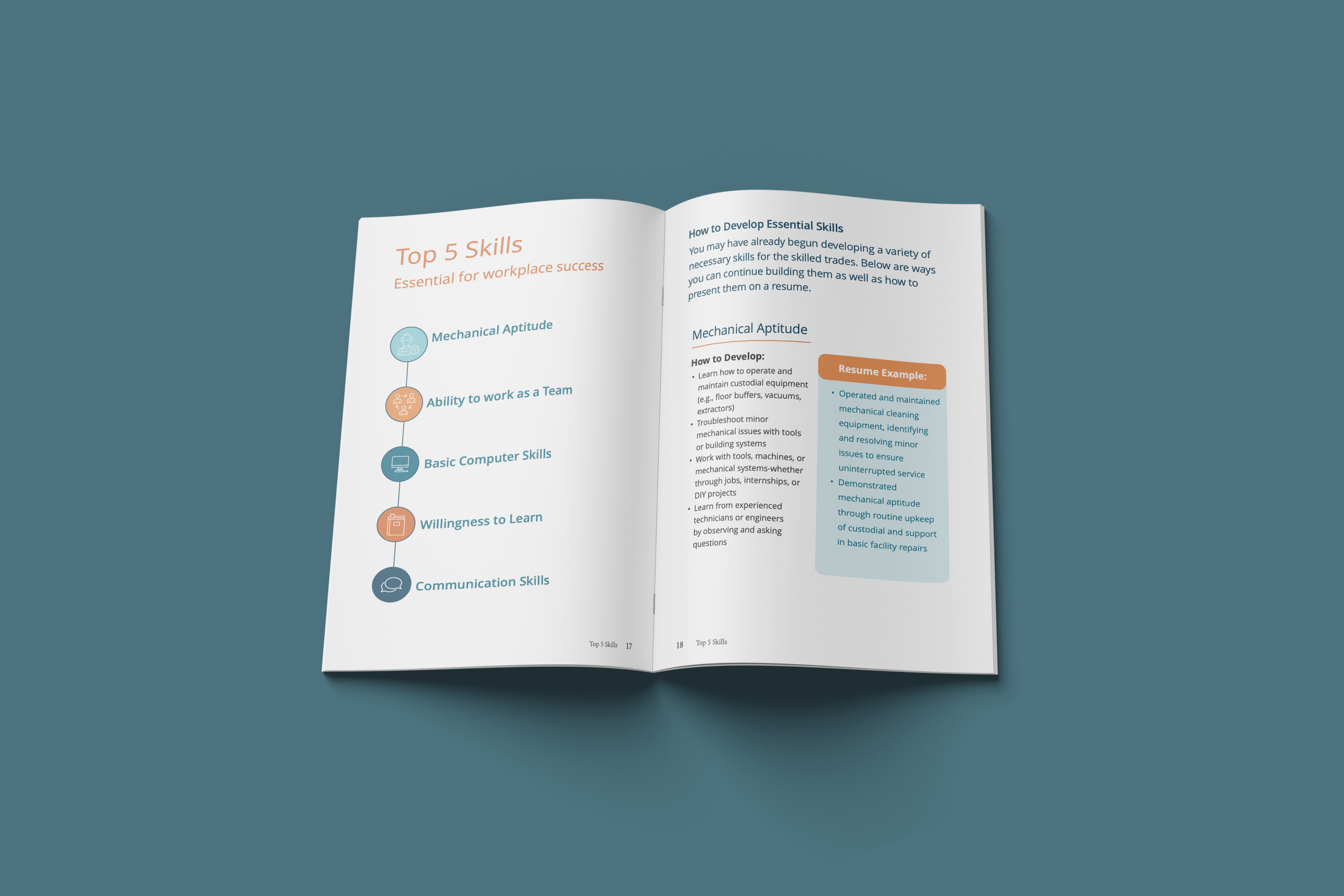
HQF wanted a concise, easy-to-navigate resource that helps employees explore training programs, skilled trades, and career development opportunities. I designed a multi-page booklet that organizes complex information into a clear, approachable and easy to read format using custom illustrations, icons, and real-world examples.
My Approach
I focused on making a large amount of information feel clear and approachable. Using consistent typography, color, icons, and illustrations, I created a visual hierarchy that makes the booklet easy to scan and navigate while staying within the established HQF brand.
DESIGN DETAILS

Graphic System
Simple geometric forms and line work create a consistent, modern visual language throughout the booklet.
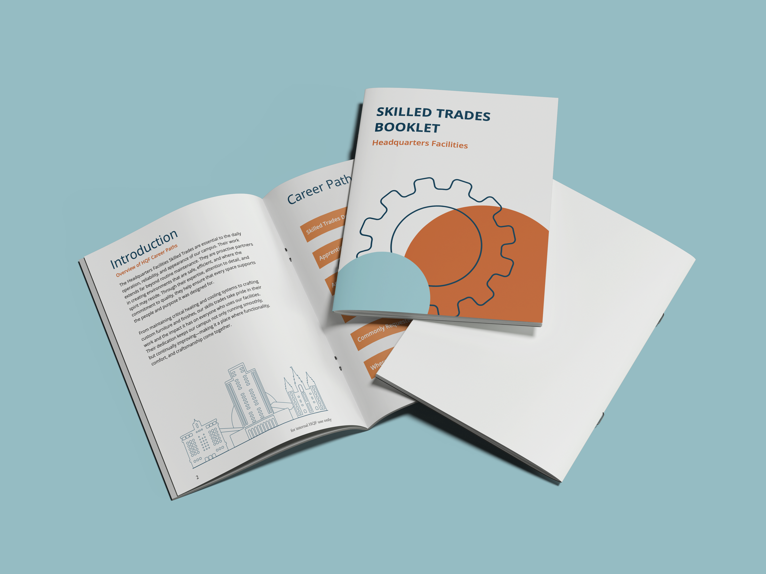
This project challenged me to think beyond how something looks and really consider how someone would use it. I learned how much of a difference clear hierarchy, consistency, and thoughtful visual elements can make when working with a lot of information.
Reflection

Illustration
Custom line illustrations help distinguish each trade and make content more engaging and approachable.
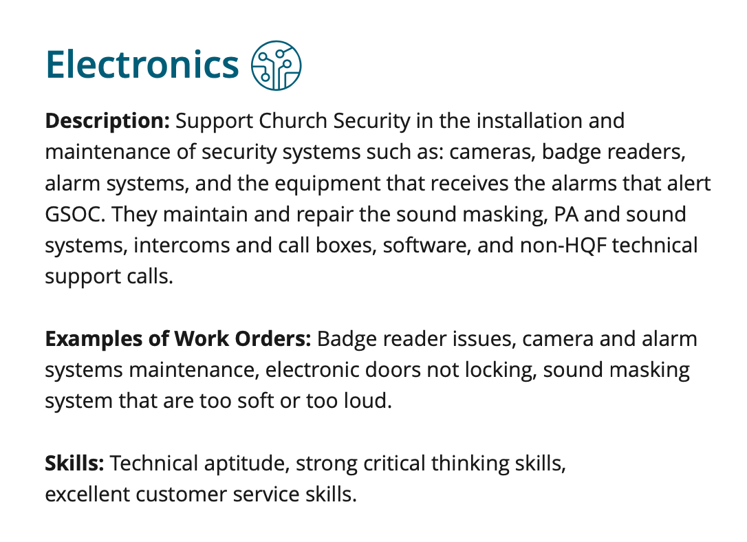
Information Hierarchy
Clear typography, spacing, and subheadings organize complex information into easy-to-read format.
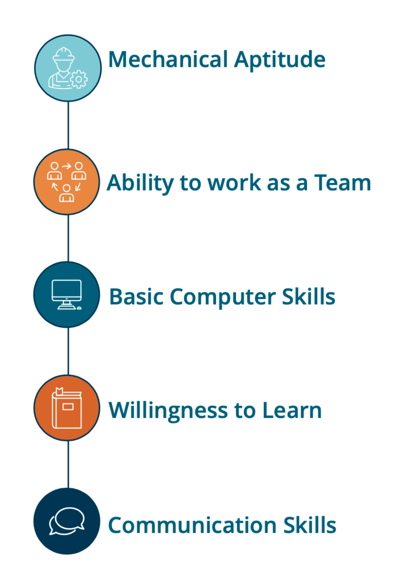
Iconography
A clean, color-coded icon system highlights key information and helps readers quickly scan important details.