
Summer Luau
Event Branding
Logo Design
Event Collateral
Project Overview
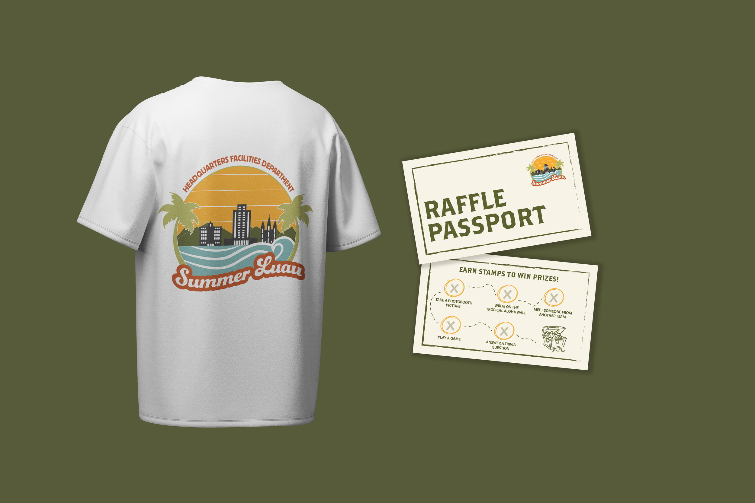
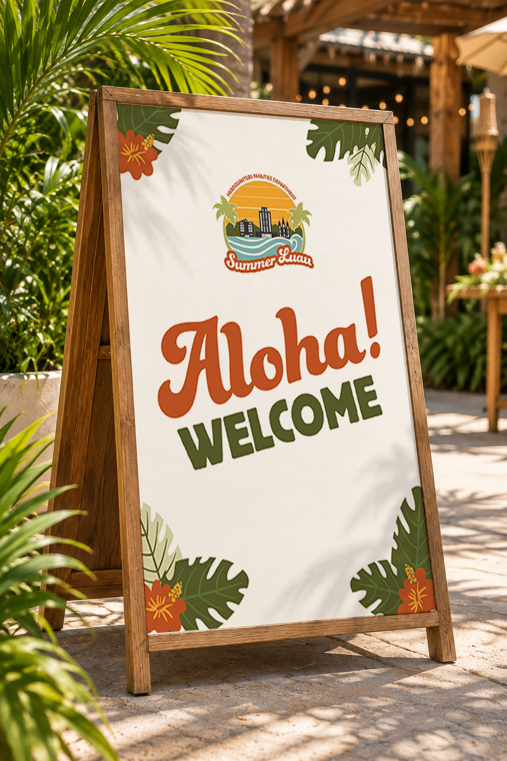
HQF wanted to refresh the branding for their Summer Luau event while keeping recognizable elements from the original event logo. I created an updated event identity and extended the design across event different materials.
My Approach
Kept recognizable building elements from the original identity
Explored multiple tropical-inspired logo directions
Used retro typography, sunset colors, waves and palms to create a playful feel
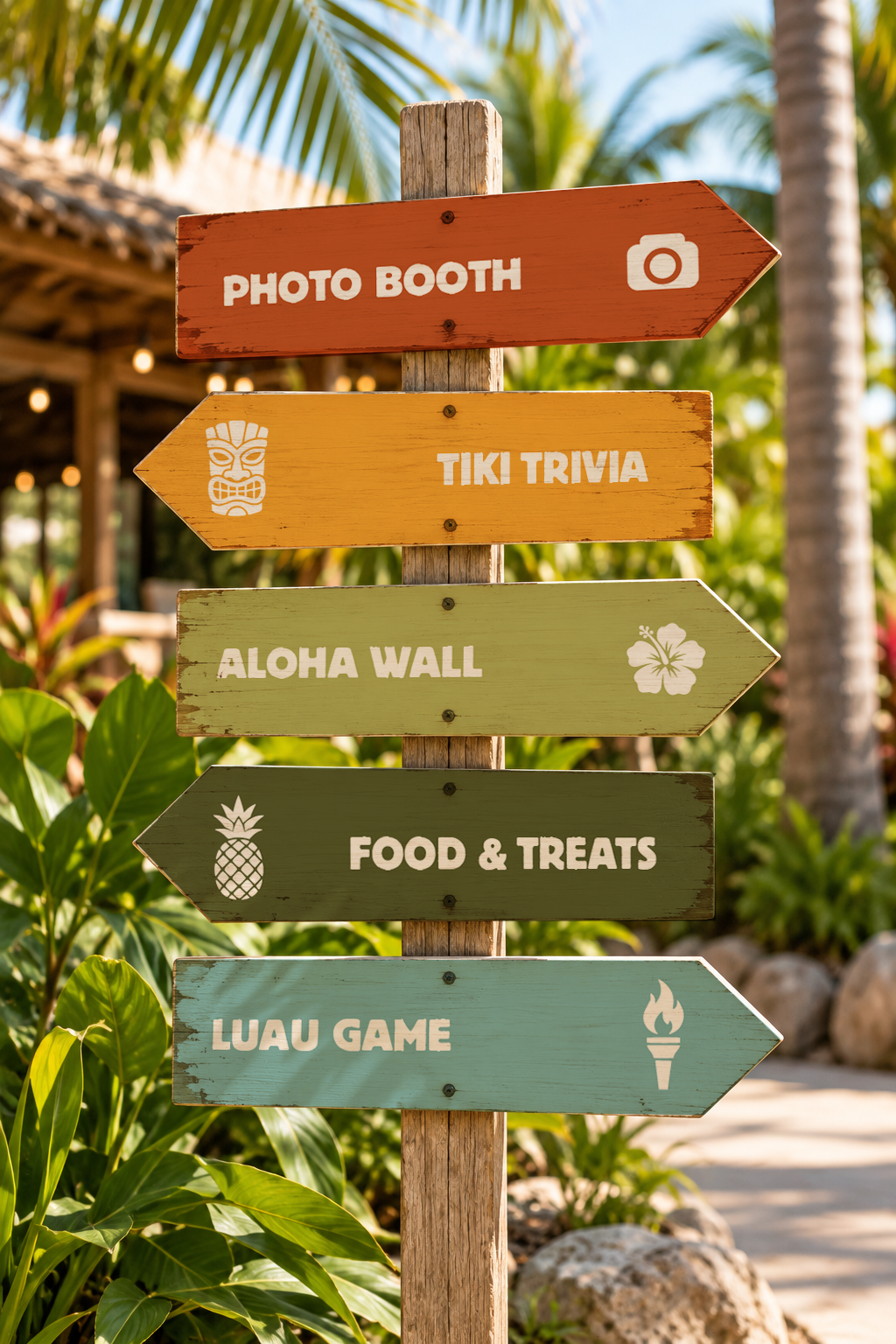
Extended the identity across event materials for a cohesive experience
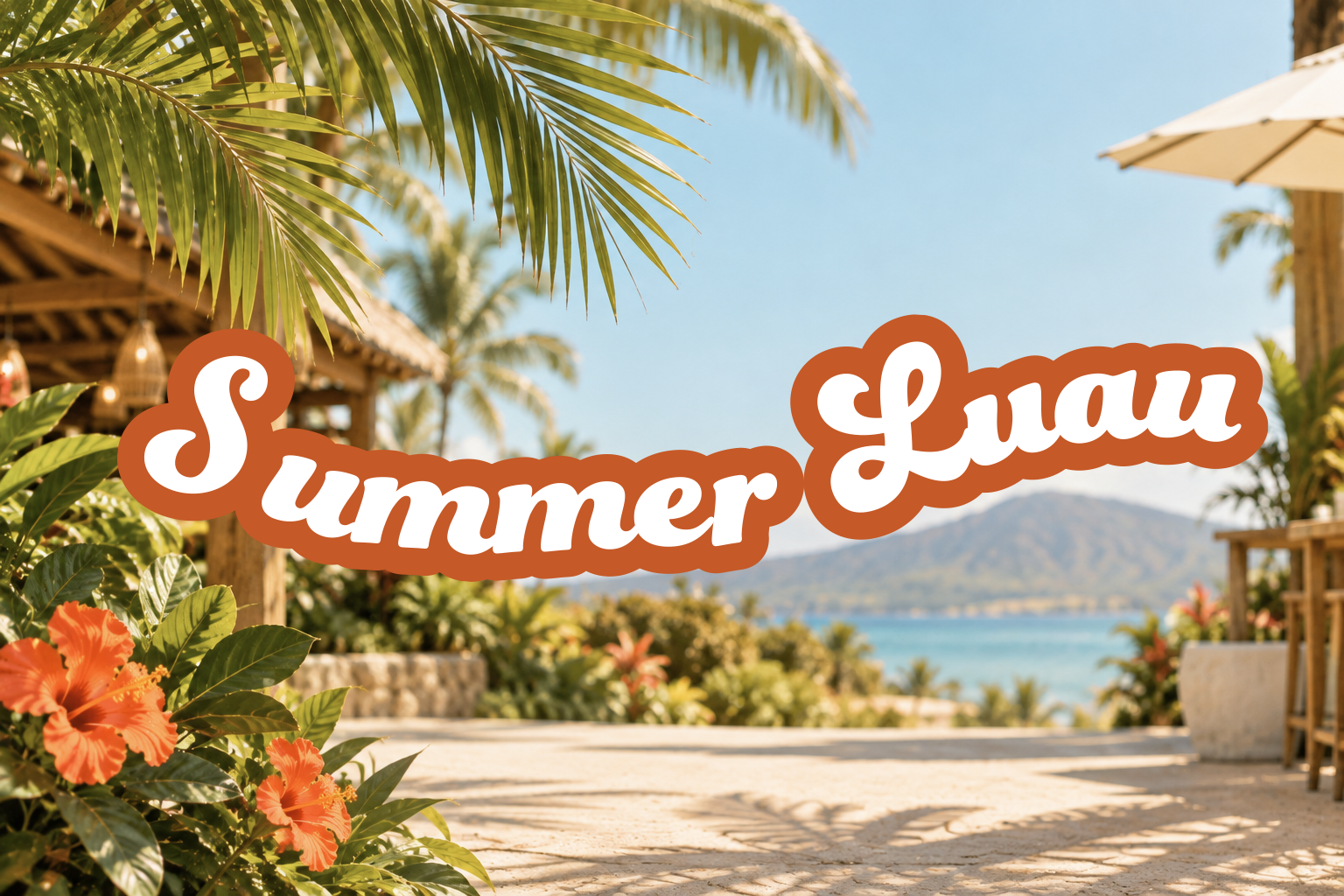
LOGO CONCEPTS
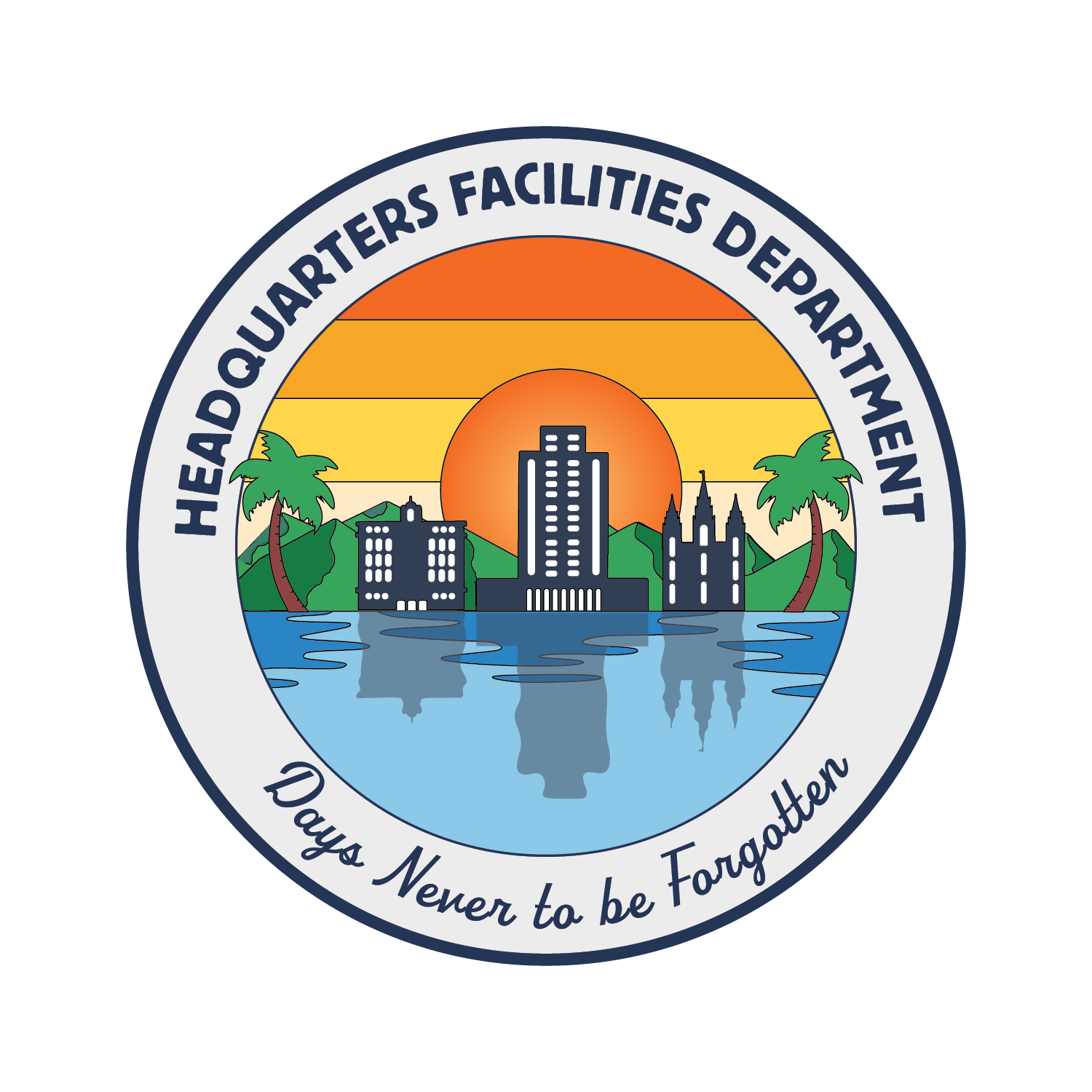
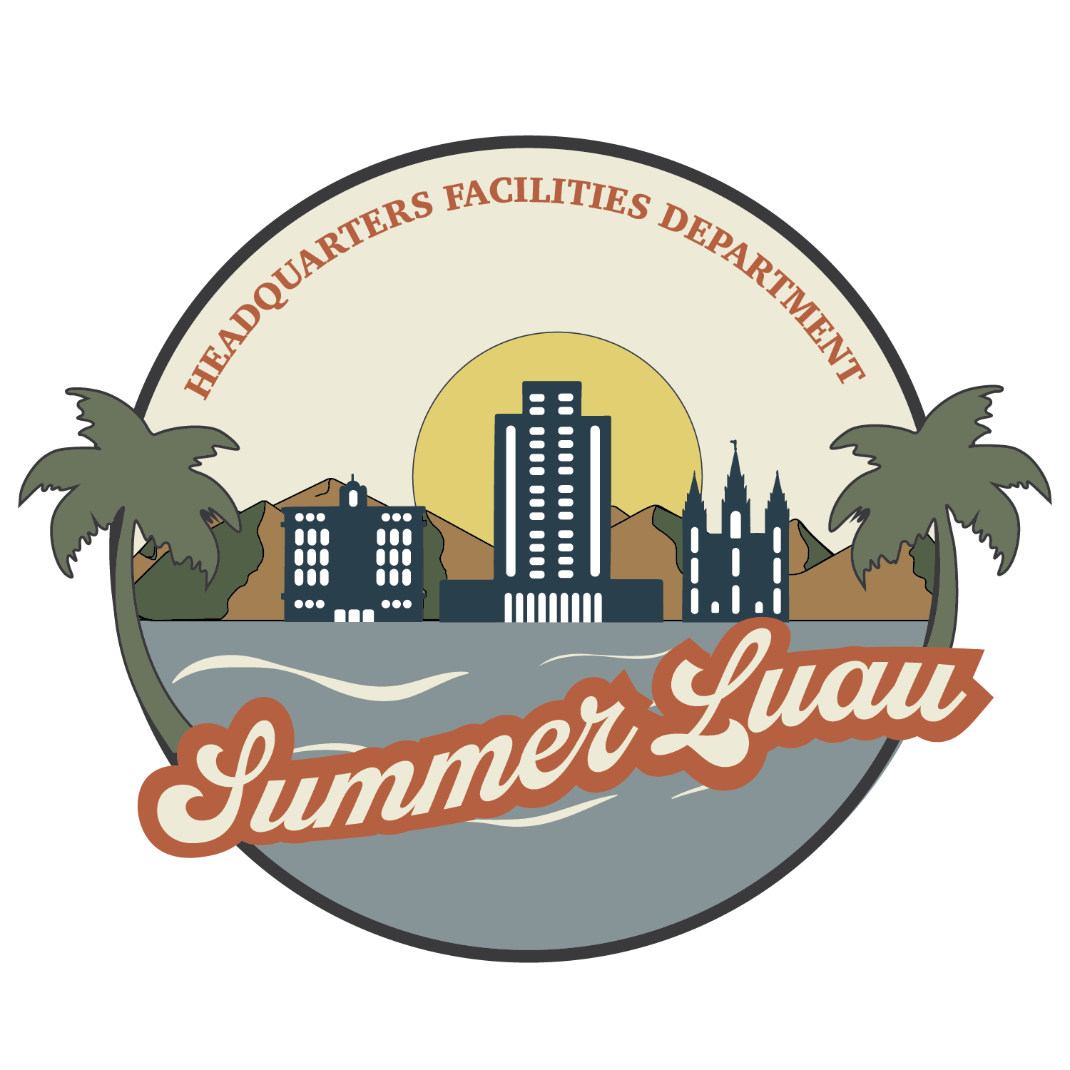
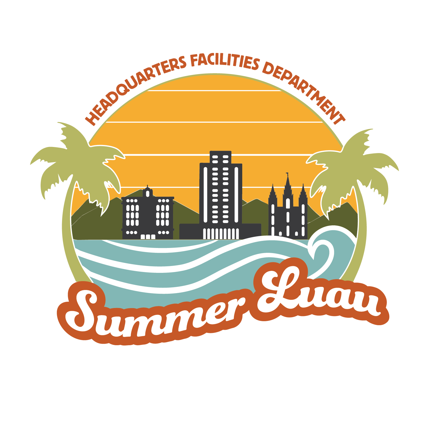
I explored several directions for the event logo, experimenting with different layouts, typography, and tropical elements. Throughout the process, I looked for ways to give the event a fresh, playful feel while still keeping the recognizable buildings from the original identity.
Concept 1
Concept 2
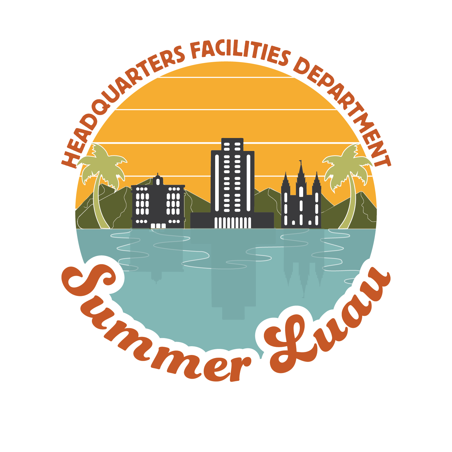
Concept 3
Final Logo
RAFFLE PASSPORT
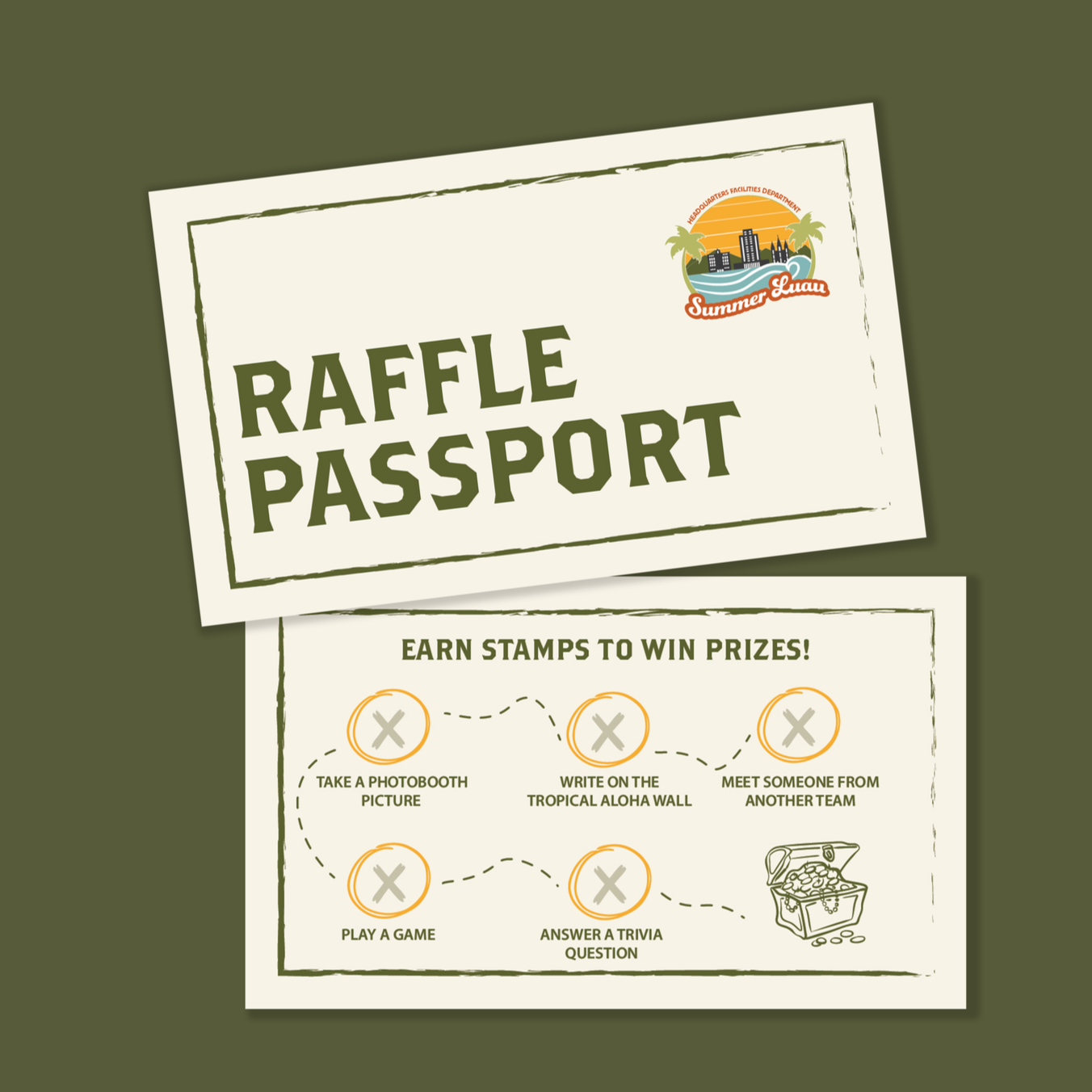
I designed a pocket-sized raffle passport that guided guests through activities around the event, with each activity signed off as it was completed. Treasure-hunt-inspired typography and details gave the card its own playful personality while elements from the event identity kept it visually connected.
Reflection
I really enjoyed seeing this project evolve from early logo concepts into a full event identity. It challenged me to find a balance between keeping recognizable elements from the original branding and bringing in a fresh, playful direction. I also learned how to adapt the identity across different pieces while still giving each one its own purpose and personality.